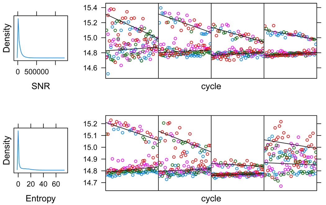
Figure 4.
Four read quality metrics. The first plot in each row gives a histogram of the metric for a sample of reads. The plots that follow in each row give exemplary data from reads across the quality metric spectrum. The leftmost is a read with very low metric value, the rightmost is a read with a very high value, the two middle reads have close to median quality metric values.

