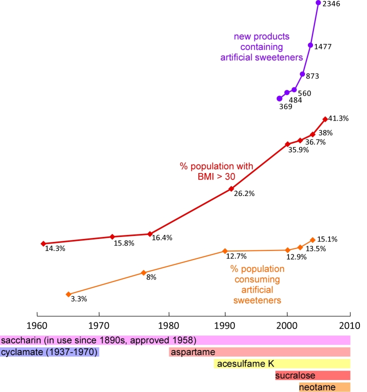
Figure 1.
Time line of artificial sweetener use and obesity trends in the United States. Blue line: changes in the percentage of the population who are obese (BMI >30) from 1961 to 2006. Source: National Health and Nutrition Examination Survey [57]. Orange line: changes in the percentage of the population who are regular artificial sweetener users from 1965 to 2004. Source: National Household Survey [2]. Purple line: changes in the number of new artificial sweetener containing food products introduced to the American market from 1999 to 2004. Source: Mintel Market Analysis [14]. Bars below the time axis indicates the type and availability of artificial sweeteners in the United States over time. Source: Kroger et al [9].

