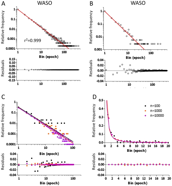
Figure 5. Power Law analysis of WASO bout distributions.
The WASO frequency histogram from the control group is shown in log-log display (A), with the fitted power law overlaid in red. A 30-patient subset of WASO is shown in panel B for comparison. Various size samples drawn from three simulated exponential distributions (with time constants of 1, 5, and 25 epochs, chosen to produce relative contributions in exponential fitting of ∼95% fast, 4% intermediate, and ∼1% slow) are shown in log-log plot (C) and linear plots (D) for comparison of exponential and power law fitting.

