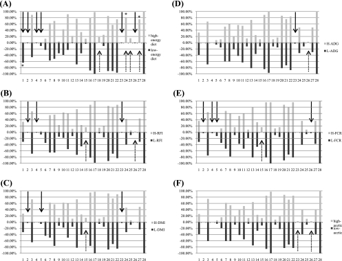
FIG. 4.
Band plot of the PCR-DGGE band frequencies. The percentages indicate the frequencies of appearance of the bands. The numbers indicate the bands from the top to the bottom of the gel. The solid arrows indicate L-group-specific bands; the dotted arrows indicate the H-group-specific bands. Group-specific bands for which the level of appearance was more than 20% are indicated by an asterisk. (A) Band plot for different diets. (B) Band plot for different RFI groups. (C) Band plot for different DMI groups. (D) Band plot for different ADG groups. (E) Band plot for different FCR groups. (F) Band plot for different acetate concentration groups.

