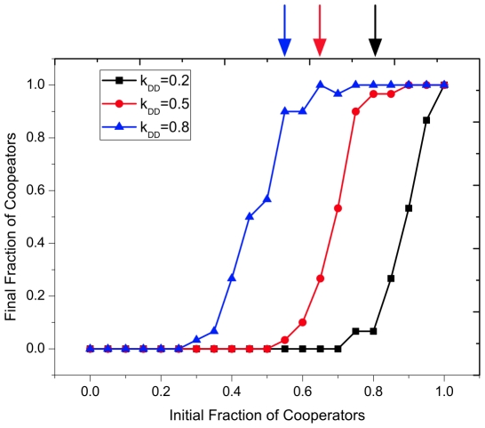
Figure 2. Final fraction of cooperators as a function of initial fraction of cooperators.
The symbols indicate the simulation while the arrows represent the analytical results. Both simulation and the analytical results show that fewer cooperators can invade a population of defectors when the  ties are more fragile, which validates the analytical prediction.
  ,
,  ,
,  ,
,  ,
,  ,
,  and
and  for all the three lines in the plot. In addition, each data point for all the plots from Fig. (2) to
Fig. (6) is averaged over
  independent runs. And in each run, we set the mean value over time window of
  generations to be the final fraction of cooperators, after a transient time of
  generations.

