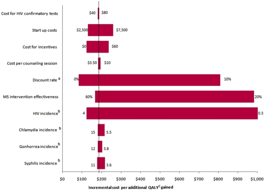
Figure 3. Tornado Diagram showing results of one way sensitivity analyses comparing no intervention to the Mujer Segura intervention offered once only.
The vertical dotted line represents the base-case analysis incremental cost per QALY (quality-adjusted life years) gained. The numbers at the end of each bar represents the range over which each of the variables was changed. a = Changes in annual discount rate used for costs and health benefits; b = Incidence is presented per 100 person-years; c = quality adjusted life years.

