
Figure 1.
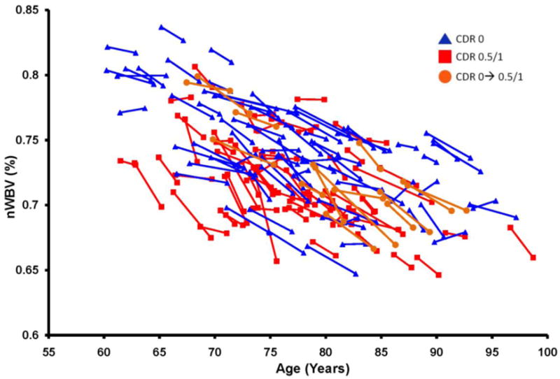
Longitudinal plot of nWBV; lines connect nWBV at baseline and follow-up scans (or the best fit, for participants with multiple follow-ups), such that the slope of each line as a proportion of baseline nWBV represents an individual’ atrophy rate.