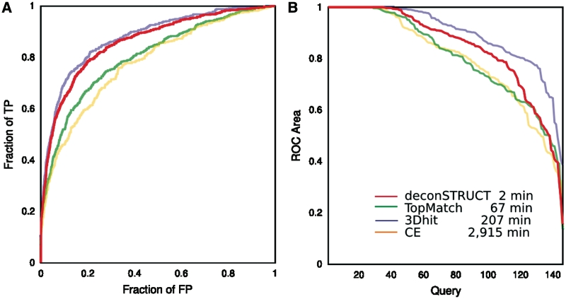
Figure 2.
Performance of the method behind deconSTRUCT, in comparison with other representative methods. The two panels give two representations of data collected in the same computational experiment. The legend corresponds to both panels. For description of the test set, see the main text. The times are CPU times, on a 3 GHz processor. Although the presented graphs use each pairwise comparison once (query-versus-target but not target-versus-query and not query-versus-self), all pairs (including query-versus. self) were used for the timing runs. deconSTRUCT uses pre-processed structure files. Pre-processing of the presented test set takes 4s. If it were it processing two full PDB entries in each pairwise comparison, as the other methods (in the implementation available to us) do, the total deconSTRUCT time would be 15 min. (A) ROC curves. For each method and for every possible pair in the test set, the quality of the structural match is evaluated. The pairs are sorted according to the match score native to each method. The ROC curve shows fraction of true positive versus fraction of false positive as the cutoff in the score value is moved down the sorted pairs list. This graph is a standard way of representing and comparing binary classifiers as their discrimination threshold is varied. (B) ROC area versus query. For each individual query, the area under that query's ROC curve is calculated. For each method, the queries are sorted according to ROC area and the ROC area is plotted as a function of (sorted) query. This plot shows the ability of the method to bring to the top of the list true positives for a given query (irrespective of the values that the scoring function might take for other queries) which is precisely the task of a server, like deconSTRUCT discussed here.

