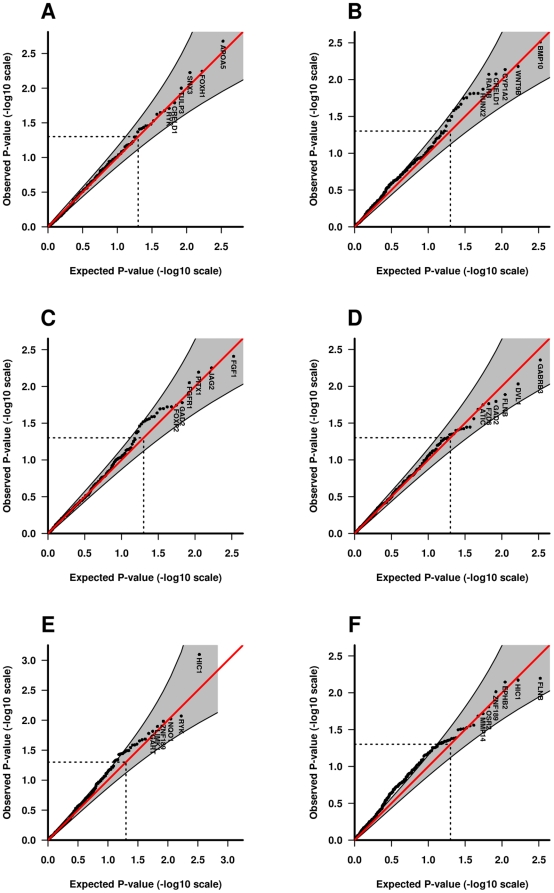
Figure 3. Quantile-quantile (QQ) plots of p-values.
The QQ plots compare the distribution of the observed Fisher-combined p-values (-log10 scale) for both populations with an expected uniform distribution under the null (sloping line). The plots for the Norwegian control-parent triads, iCL/P triads, and iCP triads are provided separately for TRIMM in A, C and E respectively (left-hand side of the plot). The corresponding plots for HAPLIN are provided in B, D and F respectively (right-hand side of the plot). Gene labels for the top six most significant genes are displayed in each plot. Shaded areas represent 95% confidence interval bands and dotted lines indicate the expected ranked p-value of 0.05.

