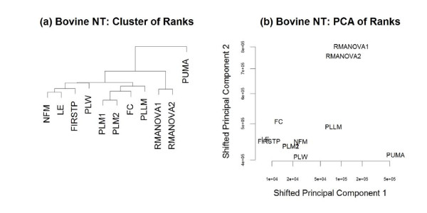
Figure 8.
Comparison of results on Bovine NT data. (a) The relationships among the methods considered here are visualized by clustering the vectors of test statistic ranks within each method when applied to the bovine NT data. (b) A biplot (based on the first two principal components of ranks of test statistics within method) visualizes the same relationships. The principal components were shifted for visualization purposes, to allow both axes to be on the log scale.

