. 2010 Jun 15;7(4):A72.

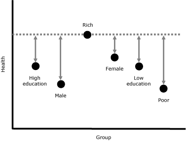
Figure 3.

Scatter graph This figure shows groups along the x axis and health along the y axis. The groups are low education, high education, rich, poor, male, and female. They are indicated by circles at various heights indicating that group's level of health. The group with the highest level of health, rich, has a broken horizontal line through the circle. All groups have vertical lines leading to the horizontal line to indicate their distance from the referent group, rich. Numbers are assigned to these distances and calculated as described in the legend.

A simplified example of the Wisconsin health inequality measure. To obtain the overall health inequality, calculate the difference from the reference health level (rich) for each group (poor, low education, high education, male, and female), sum them, and divide by the number of groups minus 1 (6 − 1 = 5).