. 2010 Jun 15;7(4):A72.

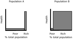
Figure 5.

Bar graph This figure shows two bar graphs, for Population A and Population B. Both bar graphs are labeled percent total population along the x axis and health along the y axis. The categories shown on the x axis are rich and poor. For Population A, a large proportion of poor people is represented by a wide bar that is short, indicated a low level of health. A small proportion of rich people is indicated by a narrow bar that is tall, indicating a high level of health. For Population Ba small proportion of poor people is represented by a narrow bar that is short, indicated a low level of health. A large proportion of rich people is indicated by a wide bar that is tall, indicating a high level of health.

Inequality judgment and subgroup population size. The width of the bars suggests the proportion of poor and rich people in the 2 populations. If we consider the degree of income-related health inequality differs in these populations, an inequality measure should be sensitive to this difference.