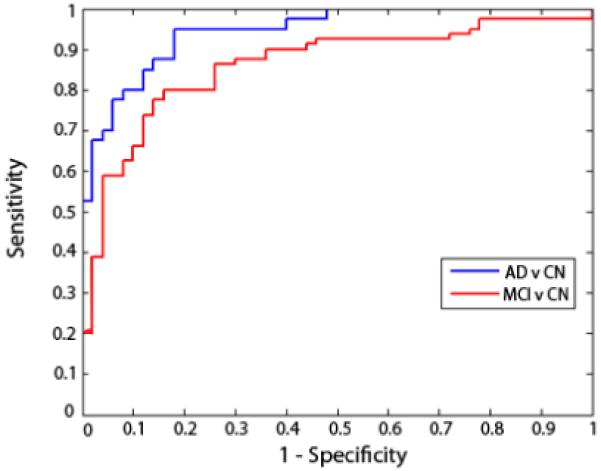
Figure 1.

ROC curves for AD and MCI classification. These curves show the trade-off between specificity and sensitivity for classifiers that best distinguished MCI from controls (red curve) and AD from controls (blue curve). The AD classifier used 4 measures and the MCI classifier only used 3. These evaluations are based on finding the top set of features that yielded the highest leave-one-out accuracies on the training set. The curves gradually rise, meaning that there is a natural trade-off: the parameters of the classifier’s decision boundary can be adjusted to be stricter or more lenient. For stricter classification settings, false positive classifications will decrease but so will the rate of true positives. Curves are slightly jagged and not perfectly smooth as they are based on a finite set of test data; with more data, they would be smoother.
