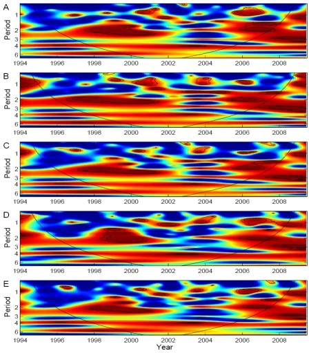
Figure 4. Wavelet coherence analyses of dengue incidence with ENSO indices.
(A) MEI, (B) NIÑO 1+2, (C) NIÑO 3, (D) NIÑO 4 and (E) NIÑO 3.4. Blue, low coherence; red, high coherence. The dotted lines show α = 5% and 10% significance levels. The cone of influence (black curve) indicates the region not influenced by edge effects.

