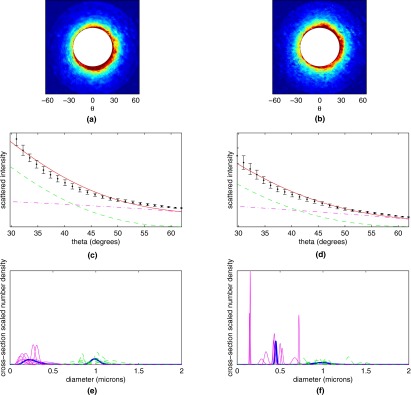
Figure 6.

Averaged scattergrams from (a) 10 control CD8+ T cells and (b) 10 CD8+ T cells stimulated with PMA. Color scale runs from blue (low) to red (high). (c) and (d) Averaged experimental data from (c) 10 control CD8+ T cells and (d) 10 PMA-stimulated CD8+ T cells (black dots) from first of the four annular bins, along with theoretical fits to the experimental data (solid curve, red online). Also plotted are the contributions from the population of smaller scatterers (dash-dotted curve, magenta online) and population of larger scatterers (dashed curve, green online). (e) and (f) Extracted populations for (e) control and (f) PMA-stimulated CD8+ T cells. Extractions for individual cells are shown in magenta and green (for the small and large scatterer population, respectively), while population extractions for the cell-averaged signals are shown with a thick blue line. (Color online only.)
