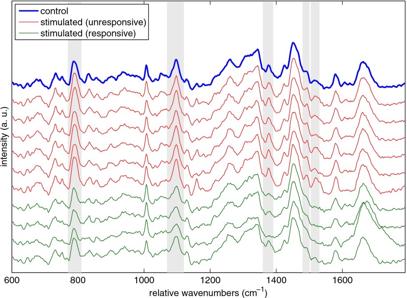
Figure 7.
Plot of the mean Raman spectrum for 10 control CD8+ T cells (thick blue online). Also shown are color-coded spectra of individual cells from the SEB-stimulated sample. Cells were labeled as unresponsive, or nonactivated (six curves below thick blue curve, red online), and responsive, or activated (bottom four curves, green online), based on the heights of the peaks marked by the gray rectangles. These marked bands represent areas of statistically significant difference between the magenta spectra and the blue mean control spectrum. Band assignments for the marked peaks are given in Table 1, showing the differences are primarily due to a decrease in DNA signal. (Color online only.)

