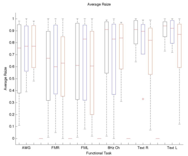
Figure 4.
Box plot of the average Rsize vs Threshold and Task. Blue indicates the selected standard threshold and black and red are the −20% and + 20% of the standard. The Rsize is not significantly affected by varying the threshold. Each bar represents the lower (25%) and upper (75%) quartile. The red horizontal line represents the median value for each threshold and task. The minimum and maximum values are represented by the brackets at both ends of each bar. The outliers are shown beyond the brackets.

