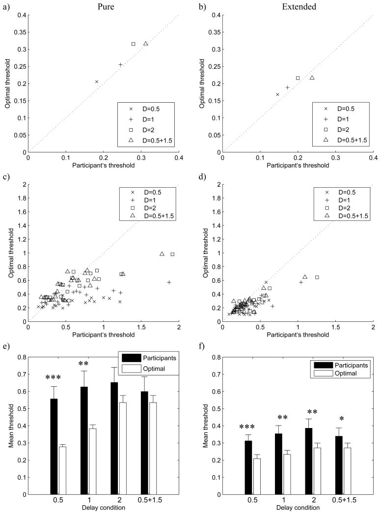
Figure 5.
Comparison of participants' and optimal thresholds in Experiment 1. The left column of panels (a, c, e) compares estimates and predictions of the pure drift diffusion model (DDM), while the right column of panels (b, d, f) – of the extended DDM. In panels a-d, horizontal axes correspond to participants' normalized thresholds, the optimal normalized thresholds are along the vertical axes, and the dotted line is the identity line. Different experimental delay conditions are indicated by different symbols (see legend). Note different scales between rows of panels. Panels a and b show a sample participant with the best fit; panels c and d show data of all 20 participants. Panels e and f show the mean participants' (black bars) and optimal (white bars) thresholds averaged across participants for different delay conditions (indicated on the horizontal axis). Error bars show standard error (there are error bars on bars corresponding to optimal thresholds, because different participants have different optimal thresholds). Stars indicate the level of significance of the difference between participants' and optimal thresholds (paired t-test): one star denotes p < 0.05, two stars denote p < 0.01, three stars denote p < 0.001.

