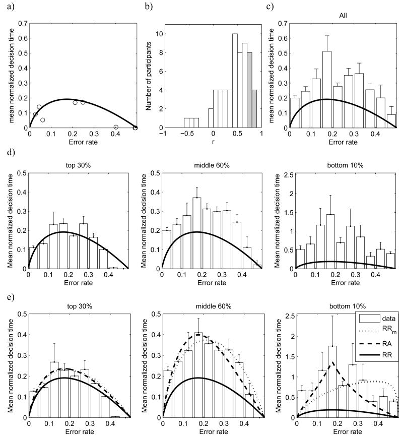
Figure 9.
Optimal performance curves. In all panels except b, horizontal axes show the error rate (ER) and vertical axes show the normalized decision time (DT), i.e. DT divided by total delay Dtotal. Note the differences in scales between panels. Solid black curves show the theoretical prediction based on the assumption that participants maximize the reward rate. a) Normalized DTs as a function for ER plotted for one participant of Experiment 2. Each circle corresponds to one experimental condition. For two conditions the normalized DTs and ERs were very close, so two circles overlap (in the bottom right corner of the panel). b) Histogram of the correlations between normalized DT and the normalized DT predicted by the optimal performance curve. Each correlation is calculated for one participant of Experiment 2. Shaded bars indicate the correlations that were statistically significant (p<0.05). In panels c-e, the bars show the mean normalized DT averaged across participants' conditions with ERs falling into the given interval (from Experiments 1 and 2). The error bars indicate standard error. There are no error bars for some bins, as there was just one condition falling into this bin, or DTs for participants' conditions falling into this bin were all very close to 0. c) The bars are based on all participants. d) The participants are divided into three groups on the basis of their reward scores and bars in each of the three panels are based on the data from the corresponding group of participants (see titles of the panels). e) Data from conditions with Dp=0 based on subgroups of participants as in panel d. Best fitting optimal performance curves for RA and RRm are also shown (see legend).

