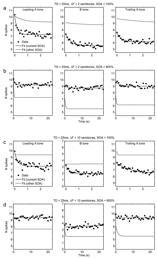
Fig. 2.
Actual and fitted spike-count data as a function of time. The data depicted here are for the following stimulus conditions: (a) TD = 25 ms, SOA = 100%, ΔF = 2 semitones; (b) TD = 25 ms, SOA = 800%, ΔF = 2 semitones; (c) TD = 25 ms, SOA = 100%, ΔF = 10 semitones; (d) TD = 25 ms, SOA = 800%, ΔF = 10 semitones. The points show mean spike counts averaged across all sites (N = 46). The solid line shows the best-fitting exponential-decay curve. Note that the spike counts evoked by the three tone types (leading A tone, B tone, and trailing A tone) are shown side-by-side within each row, although in reality these tones were temporally interleaved within each triplet; this display format facilitates comparisons among spike counts evoked by the different tones. The time is expressed in s relative to the offset of the spike-count window corresponding to the first tone of the considered type in the sequence—so that all functions start at 0 s. For pairs of plots corresponding to conditions testing the same TD and ΔF but different SOAs (100% versus 800%; e.g., pair a and b, or pair c and d), the exponential-decay curve fitted to the data shown in each plot (solid line) is re-plotted as a dashed line in the adjacent paired plot showing data for the other level of SOA. This re-plotting was done to facilitate comparisons across panels corresponding to different SOAs, which have different time scales. In addition, note that plots of the actual data points are equivalent to those that result when the data are plotted as a function of triplet number.

