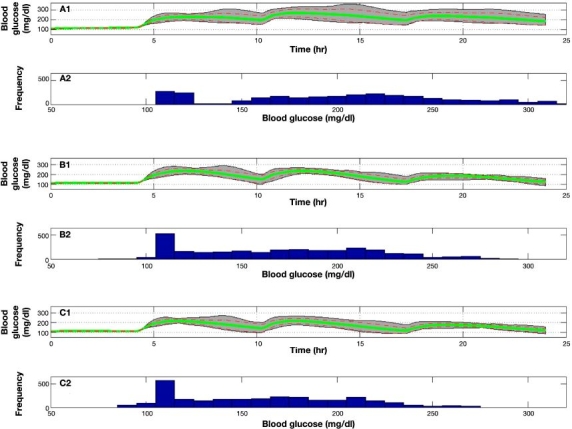
Figure 9.

Population result of experiments 2, 8, and 9 on 10 UVa\Padova subjects. Gray area bounds are minimum and maximum points at each given time instant, the green line is the mean glycemic response, and dashed red lines are mean glycemic ± SD at each time instant. Glucose distribution for experiments 2, 8, and 9 is presented in the histogram plots.
