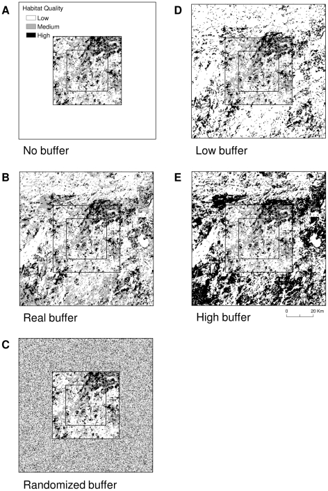
Figure 3. An example of one plot, showing the composition of suitable habitat for each scenario.
a) a plot with habitat quality data in the core only (artificial boundary); b) a buffer around the core area composed of the true habitat quality data; c) a buffer composed of randomized habitat quality data; d) a buffer composed of true data that is biased toward low-quality; and e) a buffer composed of true data that is biased toward high-quality. Map pixels were 250-m by 250-m and all buffers were 25-km wide.

