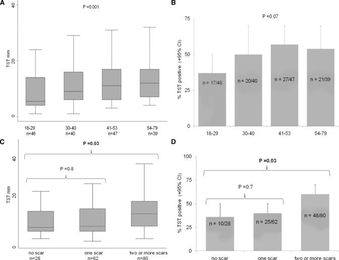
Figure 3.

TST associations in univariate analyses at the time of recruitment. Box plots (A and C) show the median, inter-quartile range (shaded), and range, excluding outliers (whiskers), for the TST size; the bar graphs (B and D) show the percentage of positive TST reactions. (A) TST size and age quartiles. (B) TST positivity and age quartiles. (C) TST size and BCG vaccination. (D) TST positivity and BCG vaccination.
