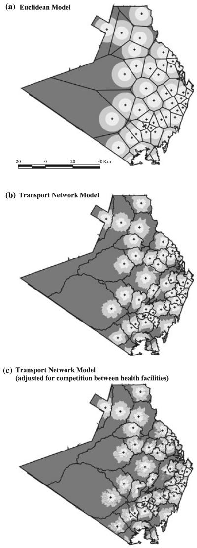
Figure 4.
(a–c) Maps of Kwale showing access to government health services based on travel time (hours) for the Euclidean, the transport network and the adjusted transport network models.  = government health facility;
  = catchment area;
  = 0-0.5 hours;
  = >0.5–1 h;
  = >1 hour. All maps are at the same scale as shown on Figure 4a. The North direction is towards the top of the page.

