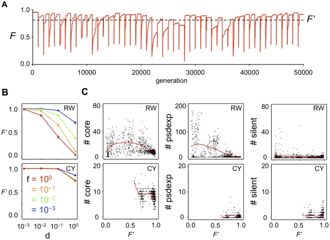
Figure 3. Relationship between the time-averaged fitness of a population and the GRN structures.
(A) An example of the changes of the mean fitness in a population during evolution. Red line indicates the mean fitness of a population at certain generation. Horizontal dotted line indicates the time-averaged fitness (F′) during the evolution in this population. (B) The time-averaged fitness of GRNs that evolved under various fluctuations of phenotypic selection. (C) The relationship between the time-averaged fitness and the structure of GRNs. Red line indicates the fitting curve to the quintic equation by non-linear least square method.

