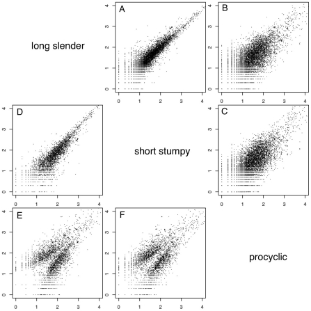
Figure 2. Whole genome comparisons of gene expression levels.
Each subfigure (A–F) shows a scatter plot of mRNA expression levels (log10 tags per million) between two life-cycle stages. Each dot represents one gene. (A) long slender/short stumpy, (B) long slender/procyclic, (C) short stumpy/procyclic. In panels D–F only genes with statistically significant difference in expression levels between any two life stages of the parasite are shown (Audic-Claverie P<105).

