


Figure 1. Kaplan-Meier survival plots indicating the proportion of women free from cardiac events (y-axis) versus time (x-axis).
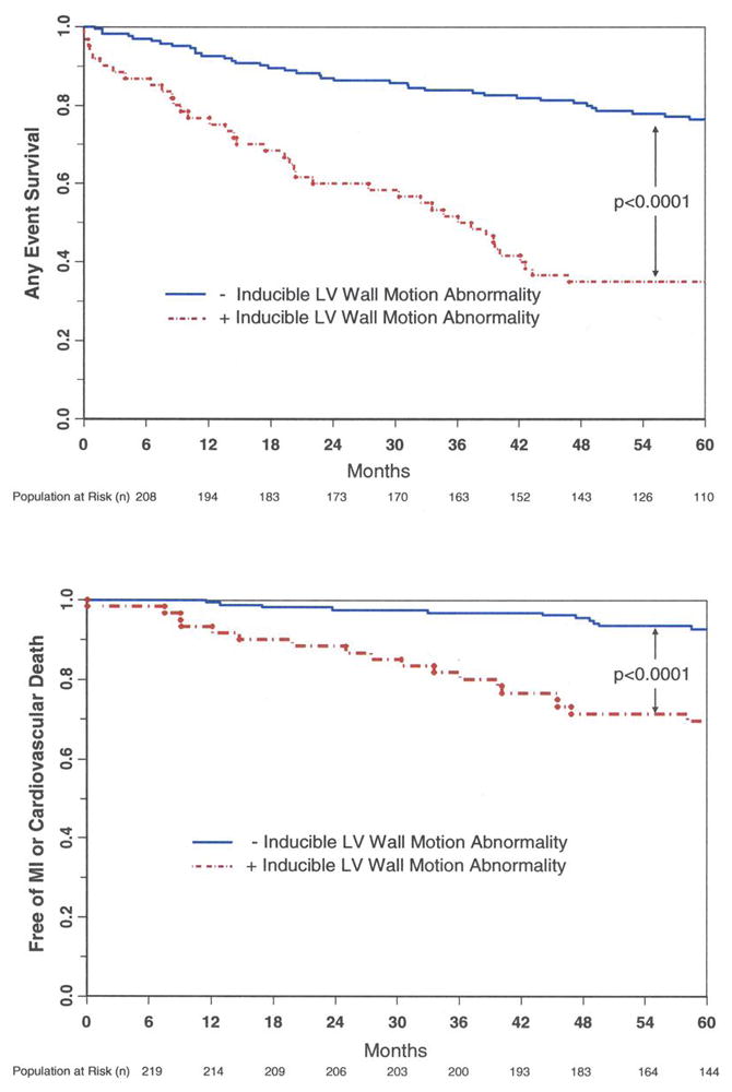
Women with inducible LVWM abnormalities are indicated by the red lines, and individuals without inducible LVWM abnormalities are indicated by the black lines. As shown, those individuals without inducible LVWM abnormalities experienced fewer (any, top graph; hard, bottom graph) cardiac events compared to individuals with inducible LVWM abnormalities.