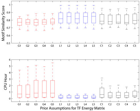
Figure 1.

Performance comparisons from simulated ChIP-chip datasets. The upper panel of the figure shows the box plots of the distribution of motif similarity scores across 15 different weight prior configurations. The lower panel of the figures shows the box plots of the distribution of CPU hours used by 15 prior assumptions over the weights. Here, the red line represents Gaussian prior assumption to the weights (e.g. G1, G2, G3, G4, and G5), the blue line represents Laplace prior approximation over the weights (e.g. L1, L2, L3, L4, and L5), and the black line indicates Cauchy priors to the weights (C1, C2, C3, C4, and C5), in which the numerical values 1, 2, 3, 4, and 5 represent regularization constant α with one, two, three, four, and greater than five classes, respectively.
