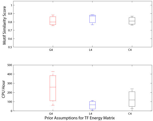
Figure 3.

Performance comparisons from human ChIP-Seq datasets. The upper panel of the figure shows the box plots of the distribution of motif similarity scores across three different weight prior configurations. The lower panel of the figure shows the box plots of the distribution of CPU hours used by three prior assumptions over the weights. The red line represents Gaussian prior assumption over the weights, the blue line indicates the Laplace prior assumption over the weights, and the black line represents Cauchy prior assumption to the weights. Here, there are four distinct weight classes in the regularization constants α.
