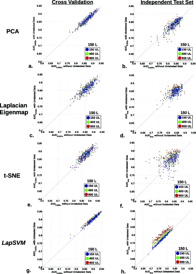
Figure 5.
Scatter plots summarizing the classification performance distribution for the entire set of the 200 generated runs. The plots display the AUC0.632+ performance for training with 150 L cases using 150 (blue), 400 (green), and 900 (red) UL cases for all 200 runs. The CV and independent test results are shown for all methods, [(a) and (b)] PCA, [(c) and (d)] Laplacian eigenmap, [(e) and (f)] t-SNE, and [(g) and (h)] LapSVM, with the x-axis denoting the AUC without UL data and the y-axis as the AUC with UL data for each run.

