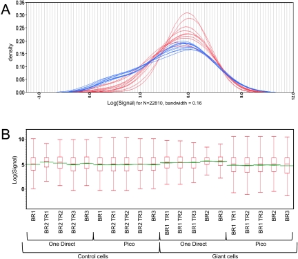
FIGURE 2.
Differences in gene-expression levels observed after Pico and One-Direct amplifications. Kernel density estimates (A) of transcript distributions across the genome. Pico amplifications are shown in blue and One-Direct in red. Box plots (B) for each microarray. Biological replicates with technical replicates (TR) are indicated. The box ends define the 25th and 75th quantiles, and the green line identifies median values.

