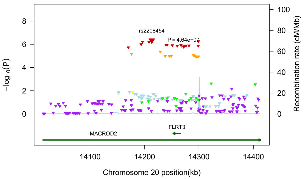
Figure 3.
Regional plot for associations in region centered on top hit. All SNPs (triangles) are plotted with their meta-analysis p-values against their genomic position. The color of the triangles represents the linkage disequilibrium between SNPs: purple: r2≤0.05, light blue: 0.05<r2≤0.10, green: 0.10<r2≤0.30, yellow: 0.30<r2≤0.60, orange: 0.60<r2≤0.80, red: r2>0.80. Light blue line represents estimated recombination rates. Genes are shown as dark green arrows.

