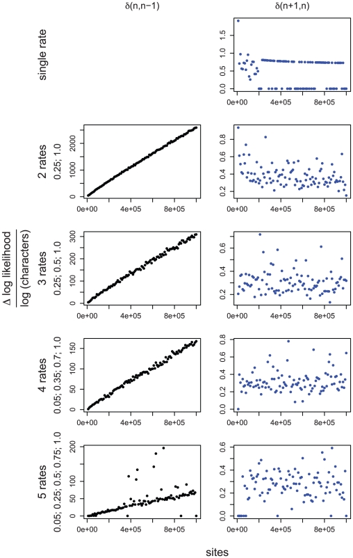
Figure 1. Simulation studies used to derive the appropriate penalty term for  .
.
Each panel plots the difference in log likelihood ( ) normalized by the logarithm of the sample size (number of characters), between best fitting GA models with
  and
and  rates (
 ), against the number of sites in the alignment. For simulations with a single rate class we plotted
  , top right. Figures for multiple rate simulations (2–5 rates) show
  as black dots (left column); and
  as blue dots (right column). Values to the right of row report simulated rates for each class. The left column is a reflection of power, whereas the right column – of the degree of over-fitting. For the case where a single rate was simulated, the degree of over-fitting is the rate of false positives. The desired behavior for
  is achieved when the model with
  rate classes is preferred to models with
  , and
, and  rate classes. For a modified BIC criterion
  with
with  , the former happens if
  (more definitively with increasing sample size), and the latter if
  (regardless of sample size).

