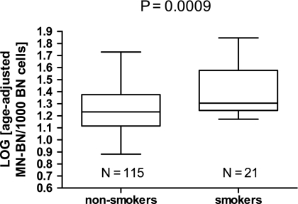
Fig. 3.
Box and whiskers plot of comparison of log-transformed age-adjusted MN-BN frequency between smokers and non-smokers. The horizontal line within each box is the median and the lower and higher horizontal edges of each box are the 25th and 75th percentile, respectively; the ends of the error bars or ‘whiskers’ represent the lowest and highest value in the data distribution. The P-value was calculated using Student’s t-test.

