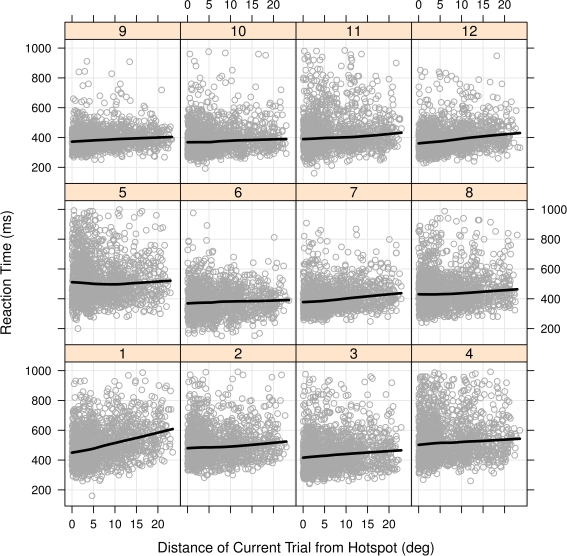
Figure 4.
Scatterplots of RT versus distance to high-probability hotspot for each participant in Experiment 1. The trend lines superimposed on each participant's data are for visualization purposes and are created from locally weighted scatterplot smoothing using the xylowess function in the R Statistical Language. Linear regression on the individual plots showed ten out of the 12 regression slopes were significantly positive, at p < 0.05.

