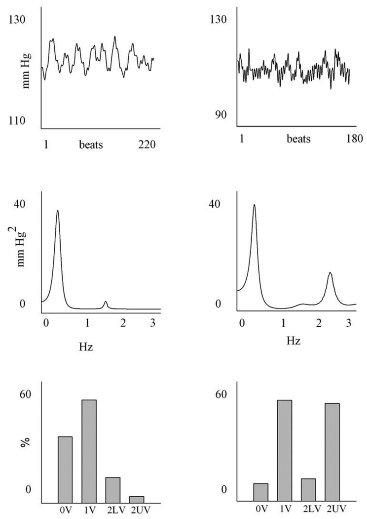
Figure 3.
An example of a time series, power spectrum and symbolic analysis of SAP. The column on the left is a SHAM animal, the one on the right is a 4 weeks CHF rat. The upper panel shows the SAP series; the units on the x axis are beats, while those on the y axis are mmHg. The middle panels show the power spectrum of the time series: the frequency, expressed in Hz, is reported on the x-axis, while the power spectral density of SAP series, expressed in mmHg2/Hz is reported on the y-axis. The lower panel represents the symbolic pattern distribution of the time series: all the patterns are divided into the four families of patterns, i.e. 0V, 1V, 2LV, 2UV and the percentages of occurrence of the four families are shown.

