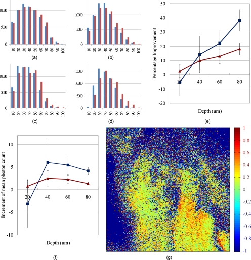
Figure 9.
Signal improvement after AO compensation. (a) through (d) show histograms for the number of pixels according to their intensity; x axis represents intensity of the pixels. For example, 10 means that the pixels have 0 to 10% intensity of the maximum in the whole image, and 100 means 90 to 100% intensity pixels. The y axis represents the number of pixels in the intensity range. The blue bars show the number of pixels before the compensation, and red bars show the result after compensation. Each histogram was normalized to itself. (a) shows the distribution at 20 μm depth, (b) at 40 μm, (c) at 60 μm, and (d) at 80 μm imaging depth. (e) Percentage improvement according to imaging depth. The red line shows the improvement with background rejection (only the fluorescent area was calculated), and the blue line shows the improvement only with 90 to 100% intensity pixels. (f) Increment of mean photon count. Red and blue lines show the same datasets as (e). (g) Percentage improvement based on each pixel. Any pixel with more than two-fold improvement, that comes from a mismatch of the uncompensated and compensated image, is saturated to a red color. The background is set to −1 for visualization purposes. (Color online only.)

