Fig. 7.
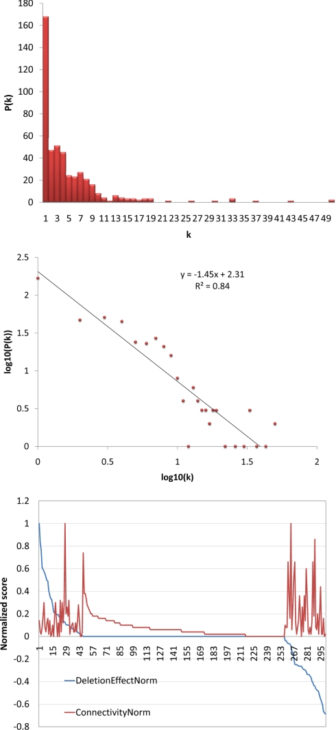
Network analysis. Top, the most highly connected nodes are the nodes that tend to exert the greatest effect on the expression of FA-responsive loci. The x axis indicates proteins from the network for which there are data on the role of the protein in expression of FA-responsive loci. The y axis is the normalized score for connectivity with 1 indicating the most highly connected node in the network. The red line indicates node connectivity (connectivity norm), whereas the blue line (deletion effect norm) indicates the role of the network protein as a negative effector (positive score on the y axis) or positive effector (negative score on the y axis) of the FA response. Middle, most nodes in the network have few connections. The x axis indicates the number of connections (k); the y axis indicates the number of nodes with a given number of connections (P(k)). Bottom, the degree of distribution of the FA network follows the power law. The x axis is the log10 of connectivity (k); the y axis represents the log10 of the number of nodes in a given bin (P(k)). Each red dot represents a given number of connections (k) from the x axis of the middle panel. This connectivity shows that this network has topology consistent with scale-free networks.

