. 2010 Aug 15;7(5):A104.

Figure.

Map The figure is a map of 13 states, broken down into counties. Each state includes at least 1 Appalachian county. Counties are shaded to indicate their economic status in terms of 3-year unemployment rate, per capita income, and poverty rate compared with corresponding national rates. Distressed counties are the worst 10% compared with all counties in the nation (n = 78), at-risk are the worst 10% to 25% (n = 78), transitional are the worst 25% to best 25% (n = 221), competitive are the best 25% to 10% (n = 26), and achievement are the best 10% (n = 7). Source: Appalachian Regional Commission, 2007.

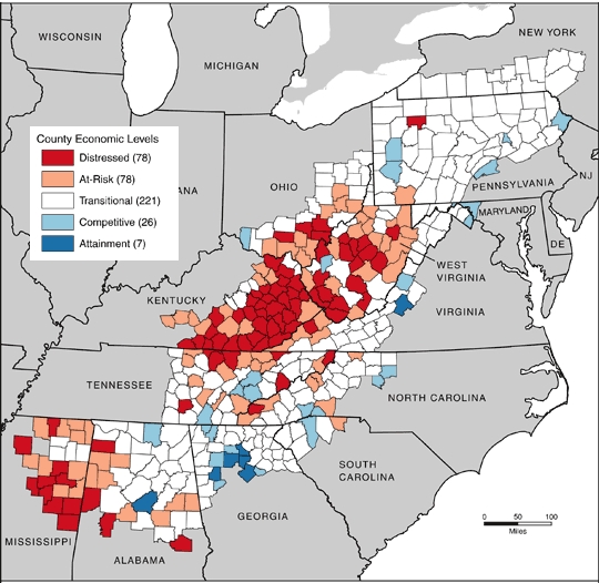
Map of Appalachia showing county development level, 2007. Source: Appalachian Regional Commission (ARC). The ARC uses an index-based county economic classification system to identify and monitor the economic status of Appalachian counties. Data sources: US Bureau of Labor Statistics, Local Area Unemployment Statistics, 2002-2004; US Bureau of Economic Analysis, Regional Economic Information System, 2003; US Census Bureau, 2000 Census, Summary File 3.