
Figure 2.
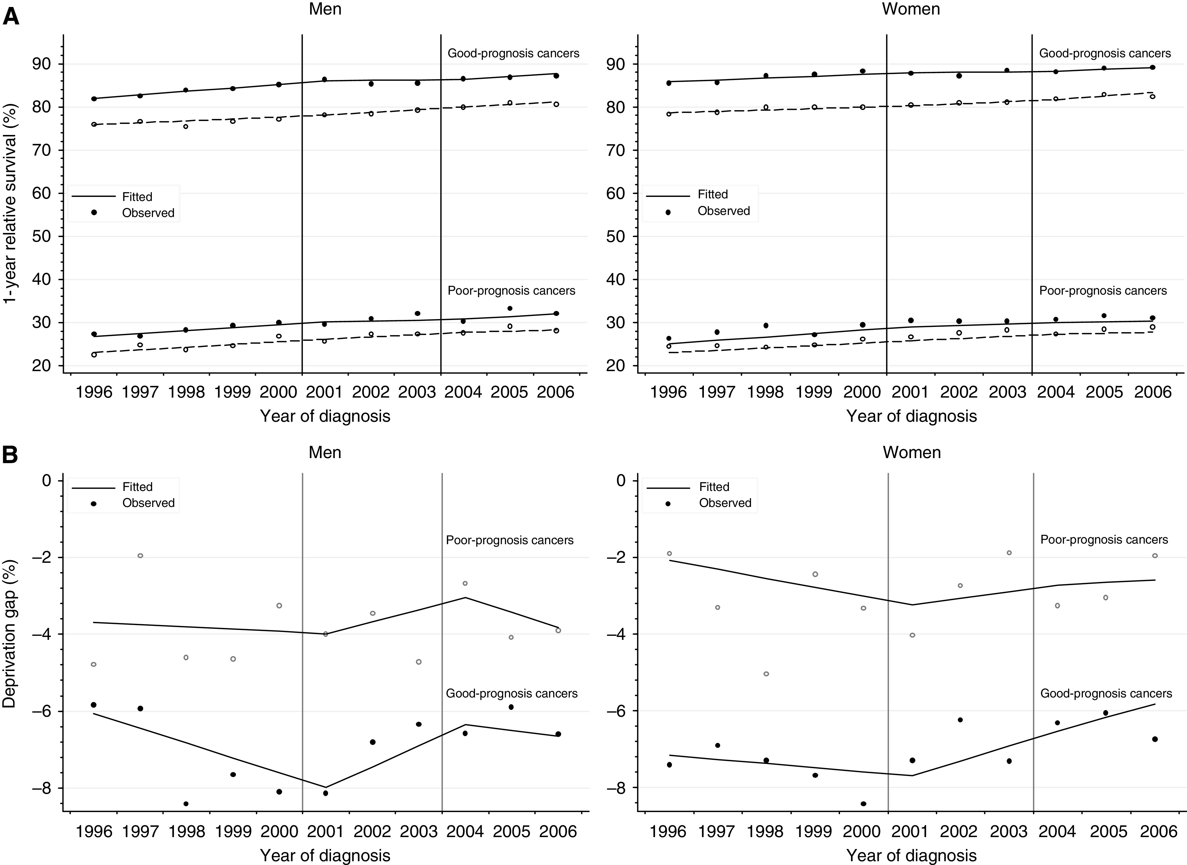
(A) Trends in 1-year relative survival for the most deprived and most affluent groups, by cancer prognosis, England 1996–2006. Lines are the regression plots fitted in a single model, which comprises every survival estimate by deprivation and calendar year (see text); dashed line: most deprived group; plain line: most affluent group. (B) Trends in deprivation gap in 1-year relative survival, by cancer prognosis, England 1996–2006. Deprivation gap is the simple difference in 1-year relative survival between the most deprived group and the most affluent group. Lines are the regression plots fitted in a single model, which comprises every survival estimate by deprivation and calendar year (see text).