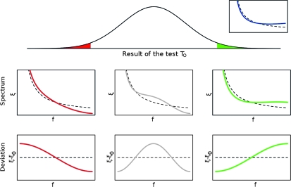
Figure 2.—
Possible results of an optimal test TO. The test is built for the expected spectrum  shown in blue at top right, where the dashed line represents the spectrum ξ0 under the neutral model. The main plot shows a possible distribution of the results of the test TO for the standard neutral model. The value of the tests can be significant and positive (in green) or negative (in red) or not significant. The plots below show examples of spectra ξ (as functions of the allele frequency f) leading to negative, not significant, or positive values of the test (the black dashed lines correspond to the neutral spectrum). The deviations of these spectra from the neutral model are shown in the plots at the bottom. Note that the red line corresponds to a frequency of rare derived variants larger than expected, opposite to what is assumed (the blue line).

