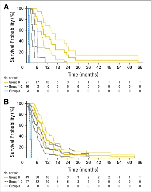
Fig 3.
Kaplan-Meier plots of National Institutes of Health (NIH) and Brigham and Women's Hospital (BWH) patients stratified according to the NIH Recurrent GBM Scale. (A) NIH patients. (B) BWH patients. For both plots, gold lines represent group 0 patients, gray lines represent group 1 to 2 patients, and blue lines represent group 3 patients. Thin light lines represent 95% CIs of the enclosed thick dark lines. Below each plot, the number of patients at risk at various time points is provided.

