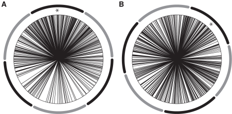
Figure 5. Phase distribution.
The phases are widely distributed around the mean (marked with an asterix). The dark and light segments around the figures represent the phase bins into which trials were sorted. (a) Simulation: Phase distribution with an exemplary mean of 91.4 from the default simulations ( /
/
 ). (b) Experiment: Phase distribution with a mean of 45.8. Adapted from [17].

