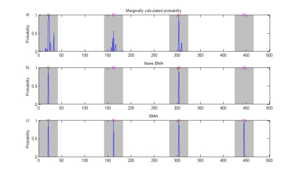
Figure 10.

Naive Bayesian model averaging illustration. The figure shows association probabilities for SNPs in a single data set obtained using three different approaches. The data set is generated according to the threshold model, i.e. it includes two pairs of interacting SNPs. However, for purposes of illustration, this data set is simpler than those analyzed in the simulation experiments as the causal SNPs are included in this data set. Furthermore, the relative risks for the different interactions were selected unequal: the interaction involving SNPs denoted by red circles has relative risk 2.0 and the one involving SNPs denoted by magenta squares has relative risk 1.8. The probabilities in panel a) are calculated by comparing a single-SNP association model with the null model for each SNP in turn. Panel b) shows the probabilities from naive model averaging, where the averaging is done over all elementary single-SNP and GxG models selected for the analysis, but not including combined models. Panel c) shows the probabilities obtained from the full BMA analysis.
