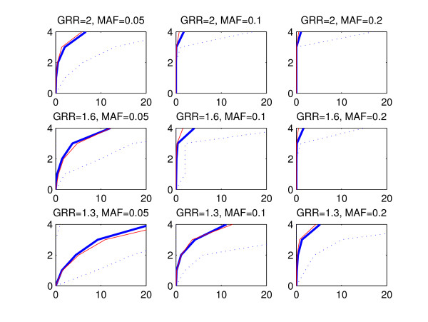
Figure 2.
Mean ROC curves, multiplicative model. The figure shows the average ROC curve (thick blue line) together with 2.5th and 97.5th percentiles (dotted lines) for the BMA method (see the text for further explanation). For comparison, the average ROC curve corresponding to the p-value method is shown (red line). The horizontal axis corresponds to the average count of false positives and the vertical axis shows the number of detected disease associated areas. The plot in each panel is based on 100 simulated data sets. The data sets were generated according to the multiplicative model, and the values of GRR and MAF parameters are shown on top of the respective panels. Notice that the scale of the horizontal axis in this figure is different from the scales in Figures 3 and 4.

