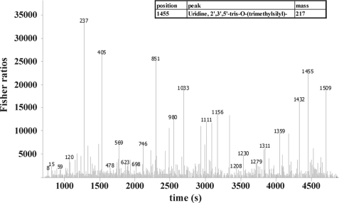
FIGURE 9.
Statistical comparison of GCxGC-TOFMS chromatograms using Fisher ratios. This plot shows the analysis of two processed chromatograms from both, WT at peak H2 and Stm6Glc4 at peak H2. The y axis represents the values for the Fisher ratio, the x axis the retention time scale. Peak heights in the Fisher ratio plot represent compounds with the highest chemical differences between the analytes. This figure represents an example of the analysis of the fisher ratio calculation. The high peak labeled with “1455” represents uridine as an example of a compound with a high Fisher ratio. Numeric values at each peak represent the position of the analyte in the processed compound table used for statistical comparison (compound table not shown).

