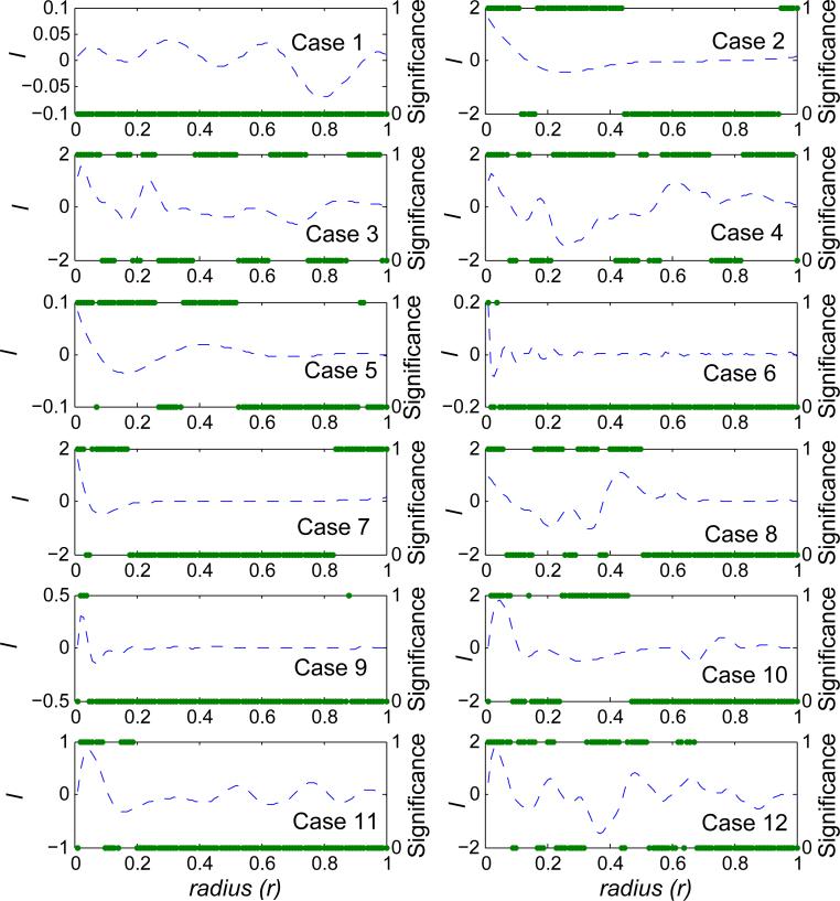
Figure 4.
Local correlation between x and y for one simulated dataset from each of the 12 simulated cases. The dashed curves are the estimated local correlations (using the y-axis on the left). The solid dots indicate the statistical significance of local correlations (using the y-axis on the right). It is labeled as 1 if local correlation is significant after Bonferroni correction, 0 otherwise. Local correlations (and the associated significance) are plotted against the radius (r).

