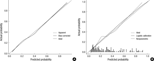
Fig. 3.
(A) Calibration curves of preoperative nomogram in internal validation cohort. The x-axis is the predicted probability from the nomogram, and the y-axis is the actual probability of ECE. The dashed line represents performance of the ideal nomogram (predicted outcome perfectly corresponds with actual outcome). The dotted line represents the apparent accuracy of our nomogram without correction for over fit. The solid line represents bootstrap-corrected performance of our nomogram. (B) Calibration plot of nomogram in external validation cohort (n=440). Solid line indicates logistic calibration curve and dotted line represent data for validation cohort.

