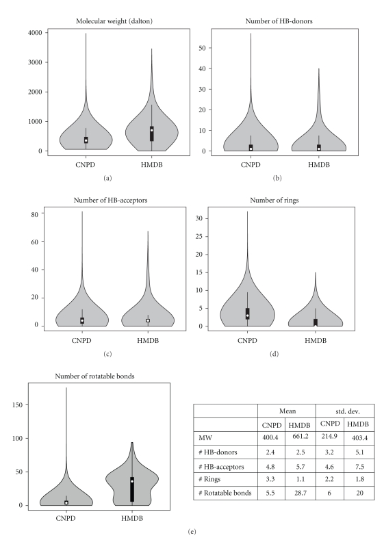
Figure 3.
Comparison of the distribution of selected druglike molecular properties for natural compounds from CNPD and human metabolites from HMDB. Violin plots for (a) molecular weight, (b) hydrogen-bond donors, (c) hydrogen-bond acceptors, (d) number of rings and (e) number of rotatable bonds, along with table with mean values and standard deviations. A violin plot is a combination of a box plot and a kernel density plot and offers a more detailed view of a dataset's variability than a box plot alone. The white marker indicates the median of the data and the black box the interquirtile range (the difference between the third and first quartiles that contain 50% of the distribution). The black lines extend to one and a half times the width of the box. Violin plots were made in R.

