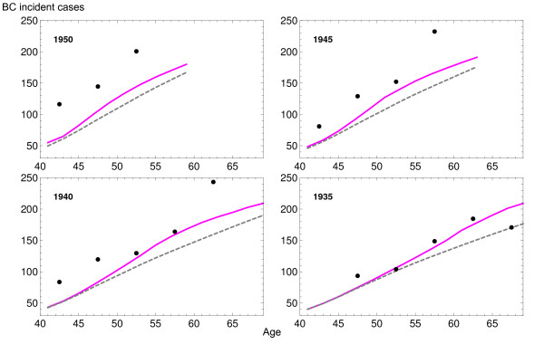
Figure 5.
Predicted breast cancer incidence rates per 100,000 women at birth. Each plot shows the results for cohorts born in 1935, 1940, 1945 and 1950: observed (points), background scenario (dashed gray line), and scenario that takes into account the actual dissemination of mammography (purple line).

